
The #1 way to #2
SQUATTY POTTY
VISUAL IDENTITY, ART DIRECTION, PHOTO, FILM, E-COMMERCE
Squatty Potty had garnered the attention of millions with a surprise viral launch and was eager to build a brand foundation for long term growth.


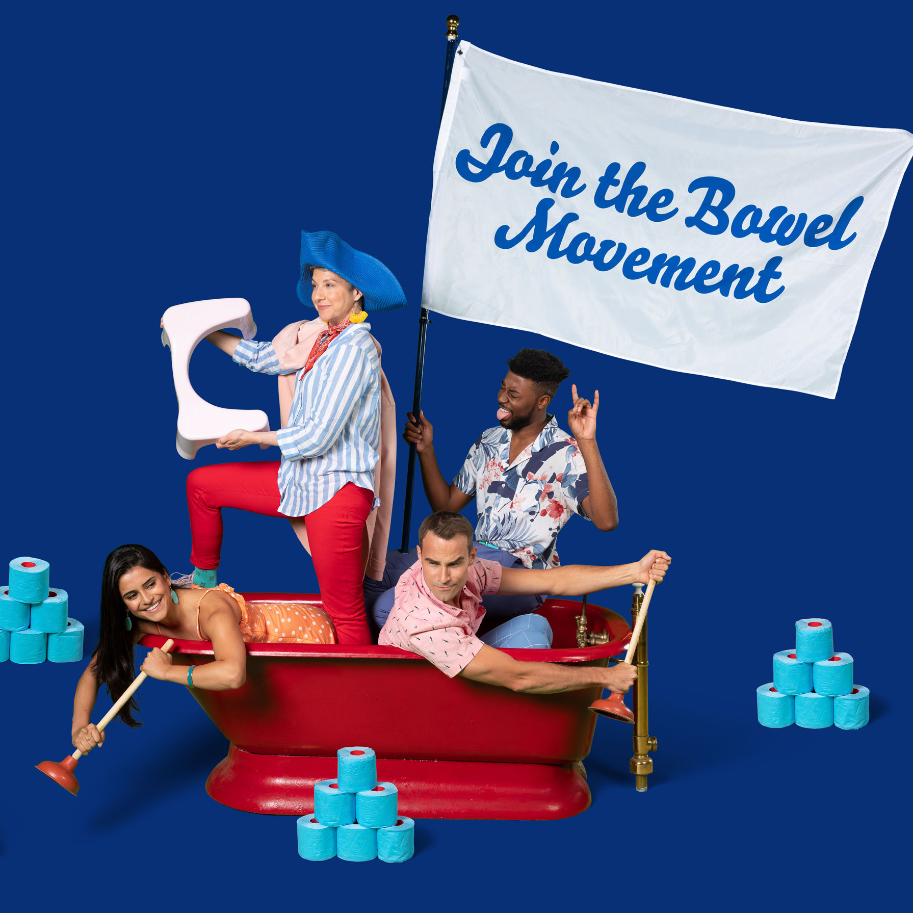
Approaching its identity with surgical precision and a dose of levity, we developed a cheeky logomark, a colorful art direction style, and a warm brand voice that talks about poop just enough.


By melding its jokester DNA with the gravitas of wellness branding, our identity elevated Squatty's stools as desirable health products backed by real science.


To announce the rebranding, we released two memorable product spots. One riffs on the aesthetic of luxury perfume commercials to convey a woman's love for her stool, and the other erroneously traces Squatty's origins to ancient Egypt.
We extended this identity across a svelte D2C site packed with vibrant imagery and a tasteful medley of bathroom humor.
Check out some more of our work.


